CREATIVE BRIEF: The college had the vision to expand their annual half marathon event to be an external community-focused marathon. The challenge was to design a separate brand for this event that captures the heart of the city while feeling appropriately athletic considering the caliber of the race.
SCOPE OF WORK: Logo and Brand Design, Environmental and Signage,
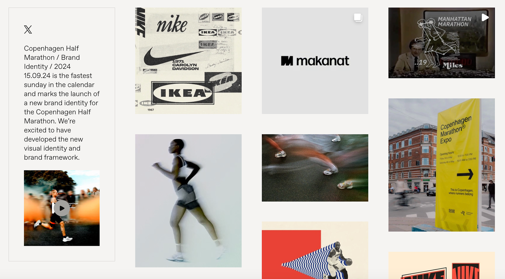
RESEARCH AND INSPIRATION: After looking into several existing marathon brands (NYC, Chicago, Boston, Copenhagen), it was apparent that their brands reflected the city they were in. Copenhagen has a minimal streamlined feel that matches the history of designers that has come out of the area (Dansk, Finn Nygaard, etc). NYC always pays some kind of homage to the landscape runners experience.
Seeing that intentionality inspired me to look into the history of Birmingham as a whole. What I discovered was that Birmingham has a unique set of resources that paved the way for it to be the city it is today. Birmingham has earned the nickname "Steel City" from the steel production that boomed in the early 20th century. But few know that this boom was only made possible by the unique combination of metals available in the area: iron ore, coal, and limestone.
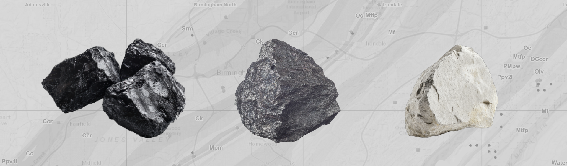
Having all three minerals in one place spurred the production of steel immensely and ultimately allowed the economy of Birmingham to become what it is today. Inspired by this, I wanted the brand to have that tough industrial feel while still feeling relevant in the runner space of today.
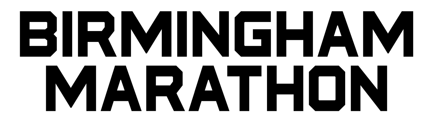
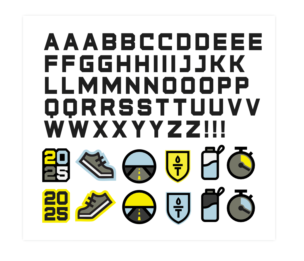
The final stacked logo: a strong and geometric font called "Statewide" that still has a sports/athletic feel to it.
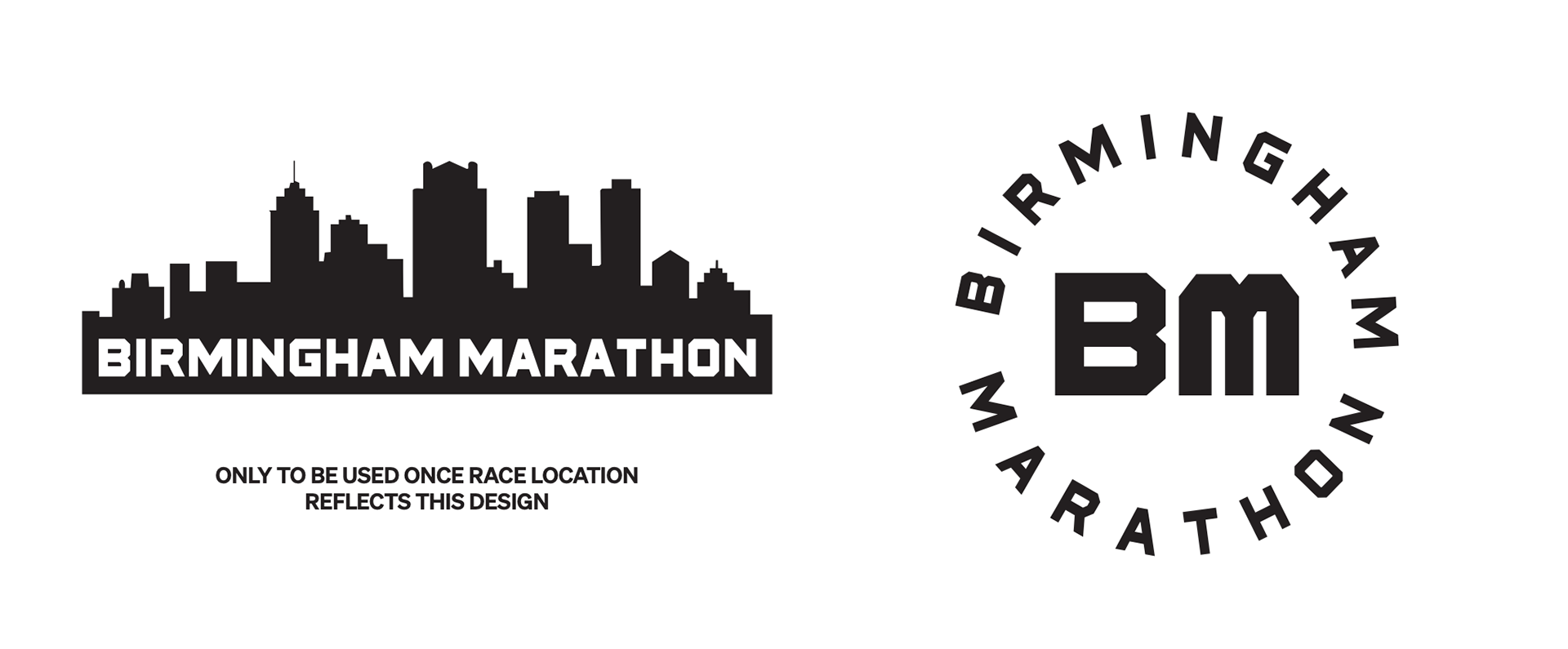
Additional versions of the logo that could be utilized. At the time of creation, the race was still outside of the downtown area but the team had plans to move it into the metro area.
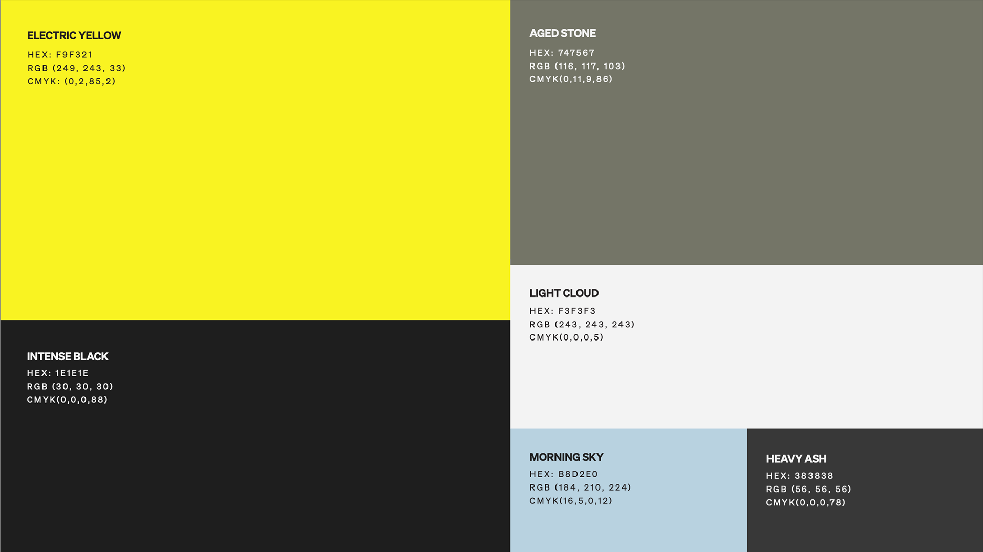
A bold color scheme that has high contrast but still natural elements to it. It also correlated back to the three minerals: Intense Black = Coal, Aged Stoned = Limestone, Heavy Ash = Iron Ore.
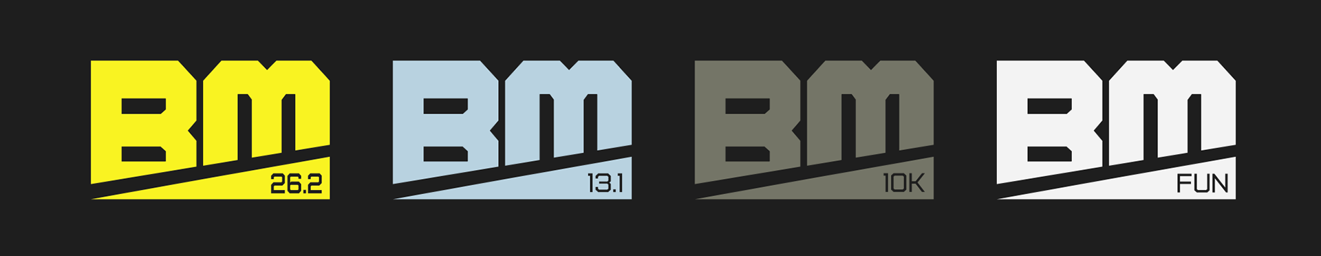
While the event centered around the marathon, the team was also providing a half marathon, 10K, and fun run. These icons served as identifiers for the event for each race.
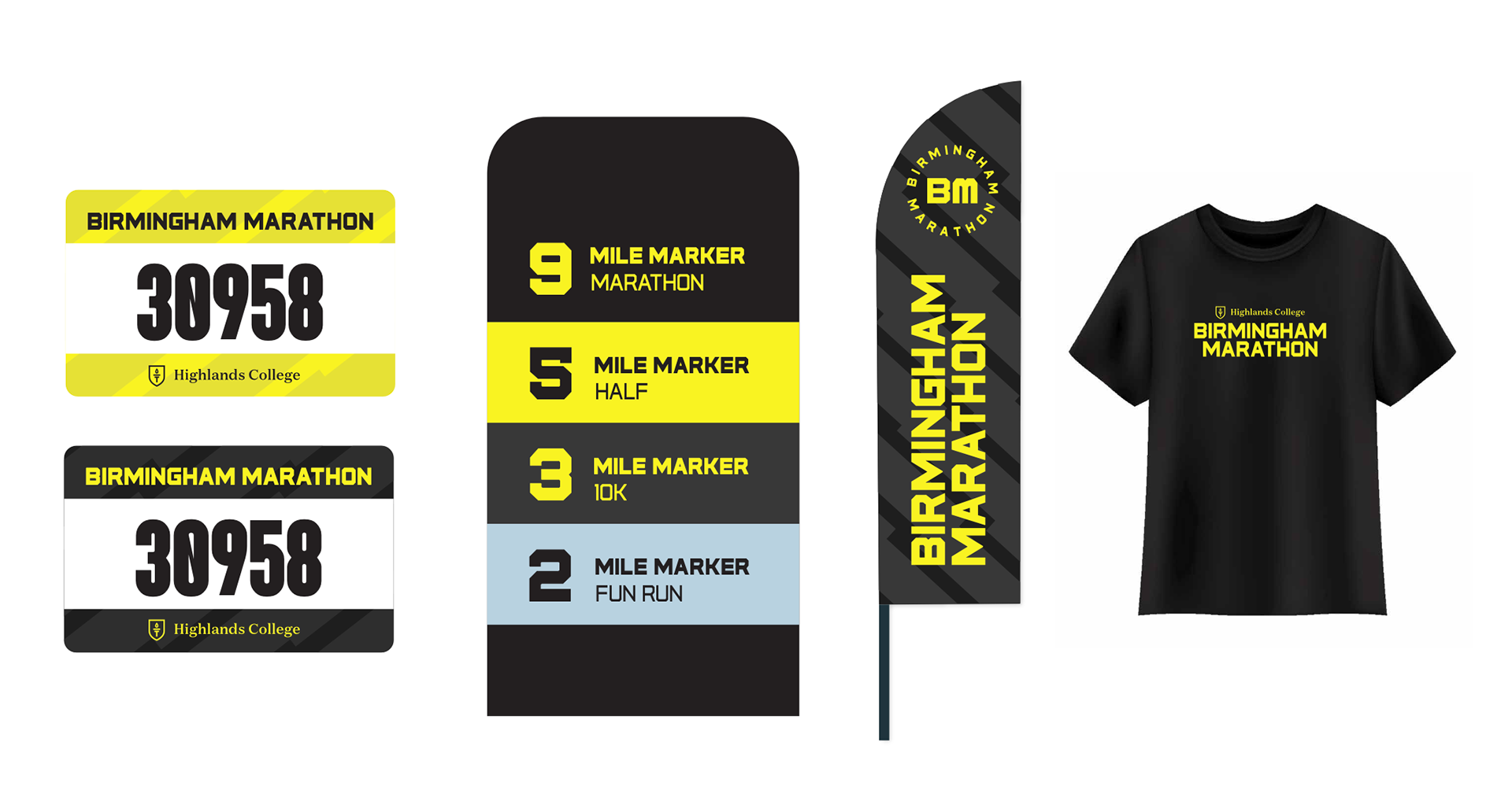
Initial mockups for deliverables including race bibs, race length signage, flags, and race shirt.
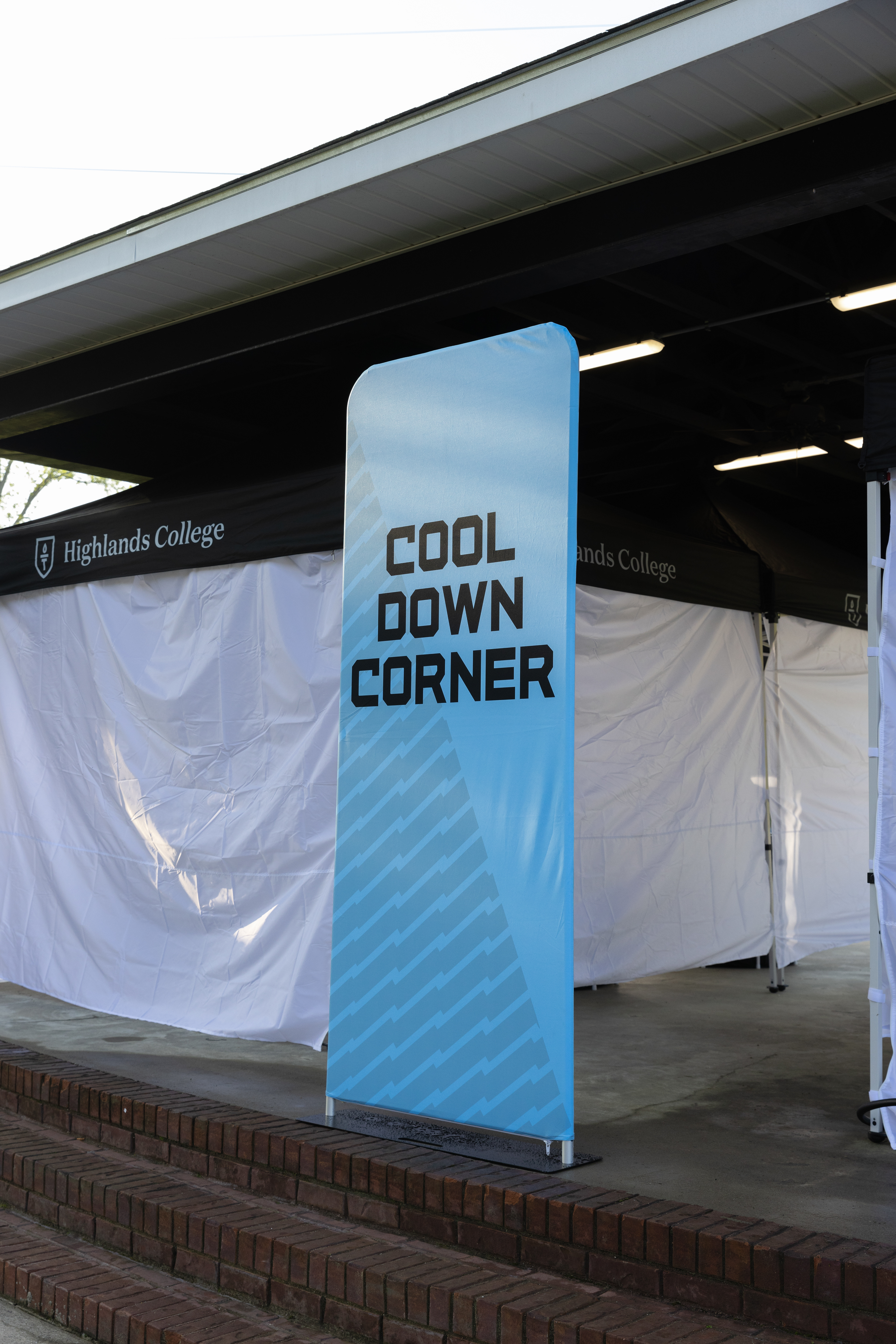
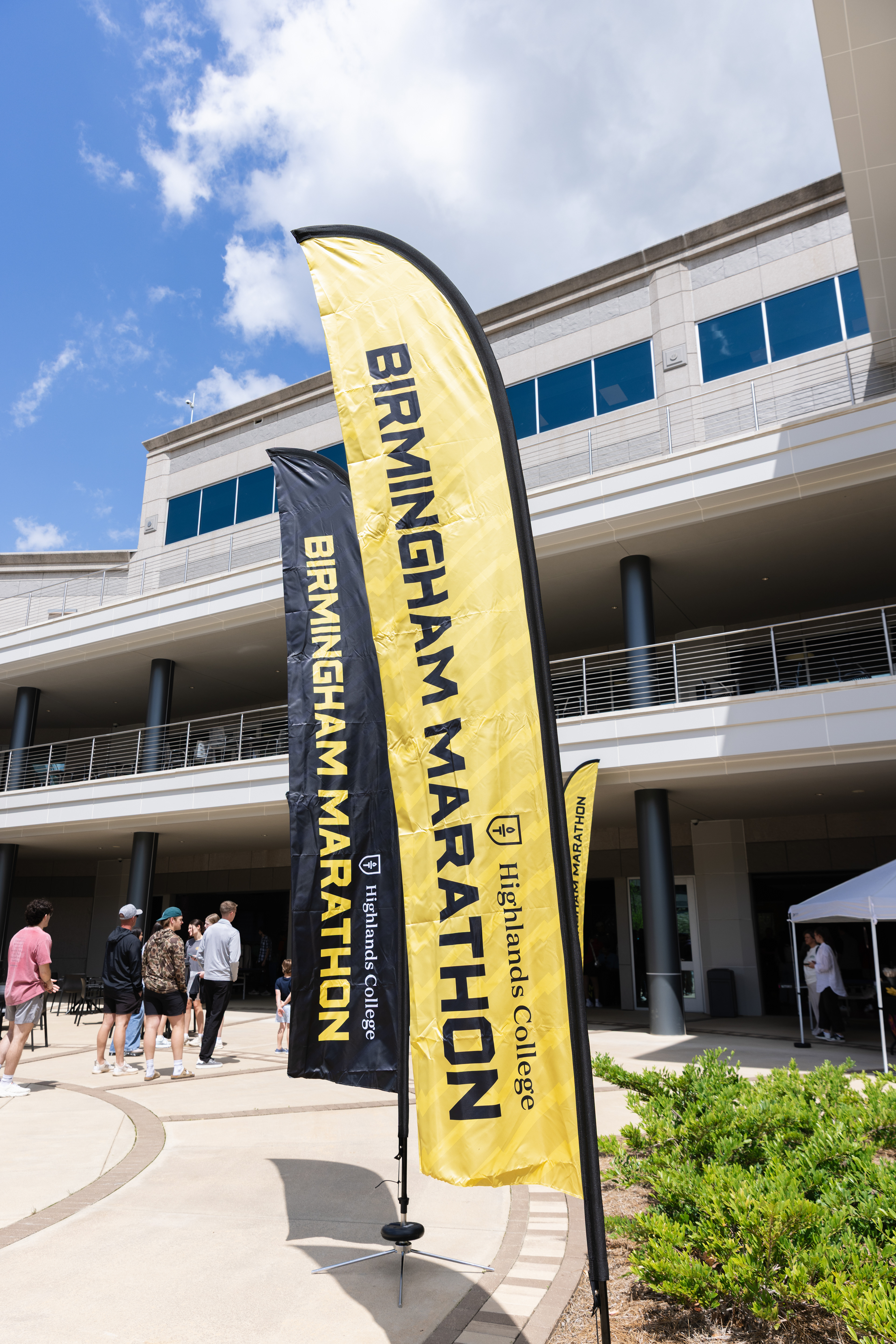
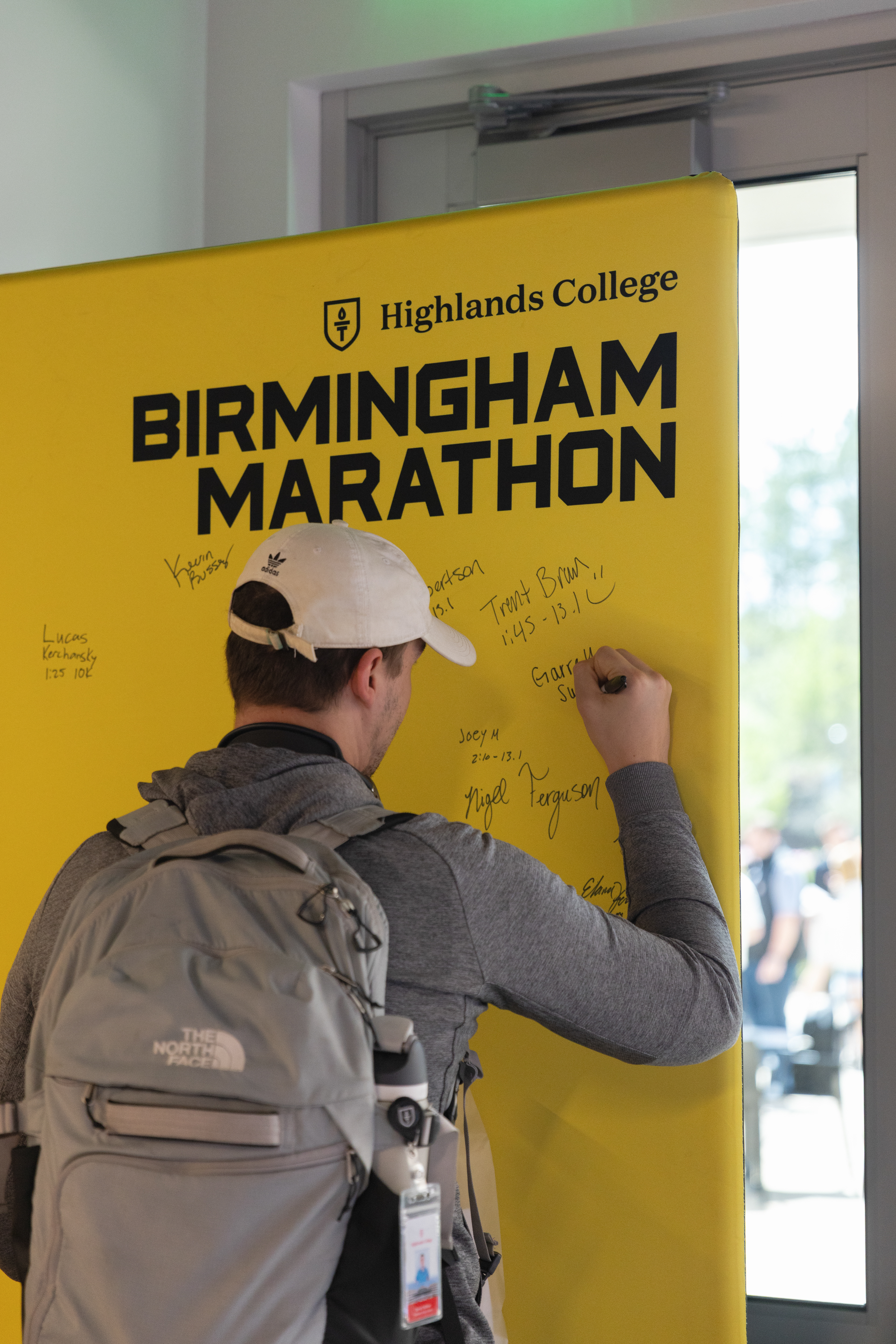
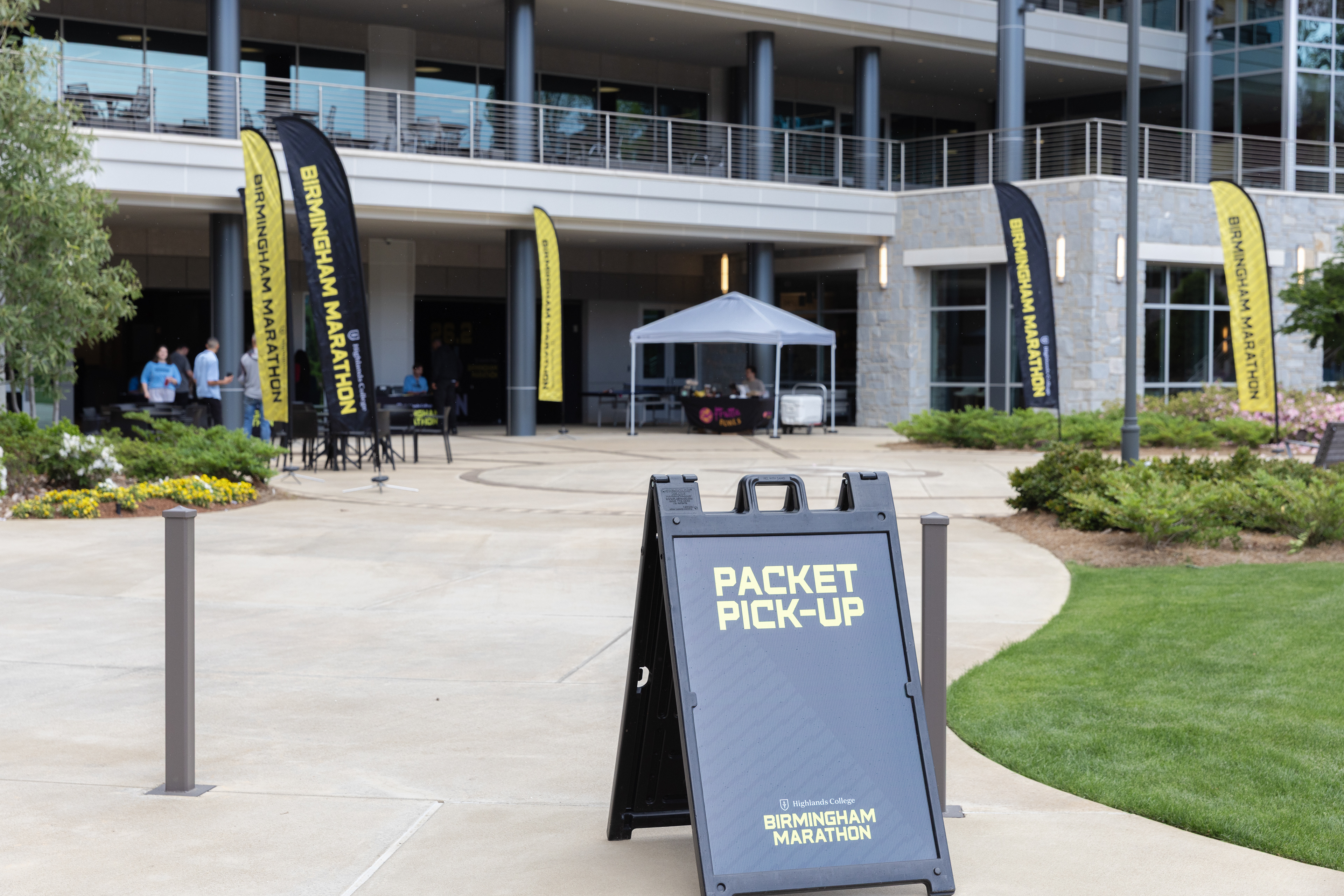
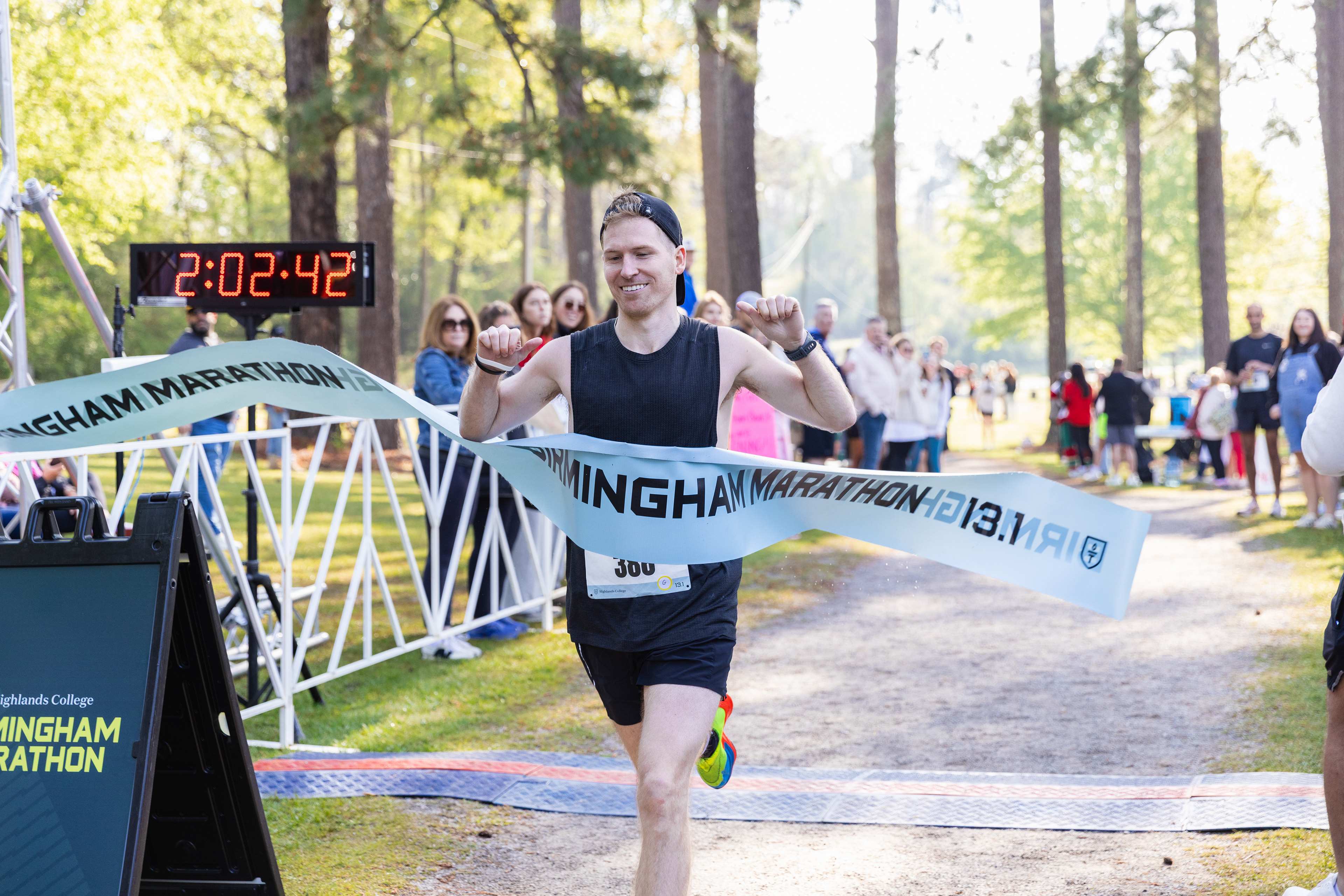
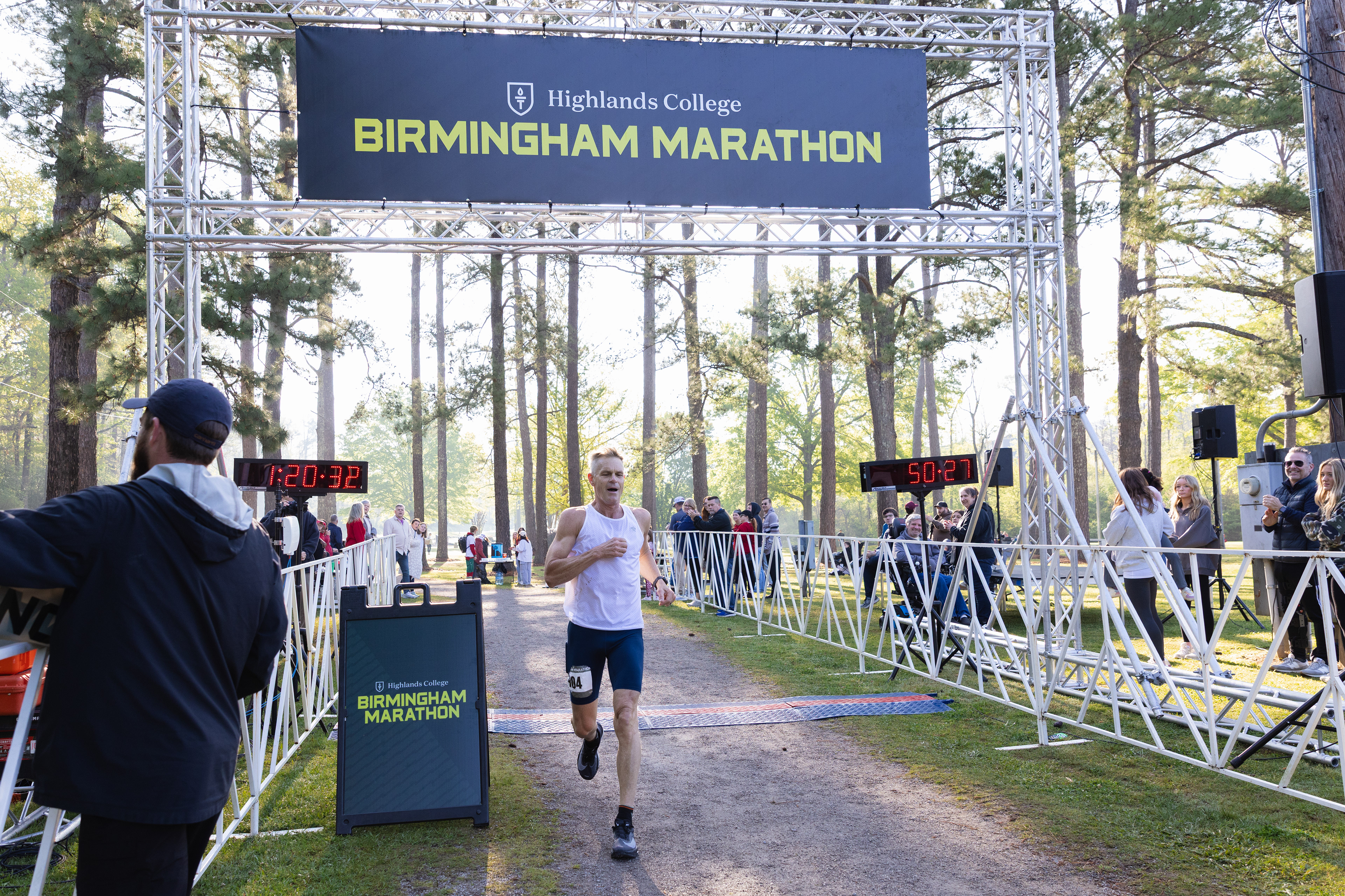
The final deliverables came down to both the race day and an expo the day before where runners picked up their bibs. The brand was executed across the following items: race bibs, a-frame signage, flags, a signing board, stickers, fabric banner, and more.
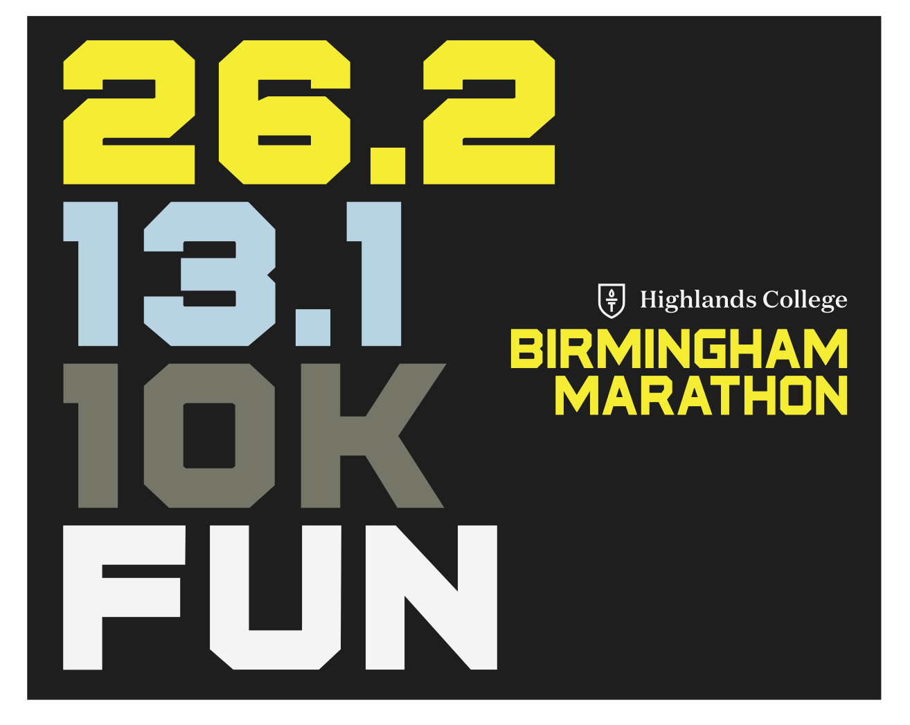
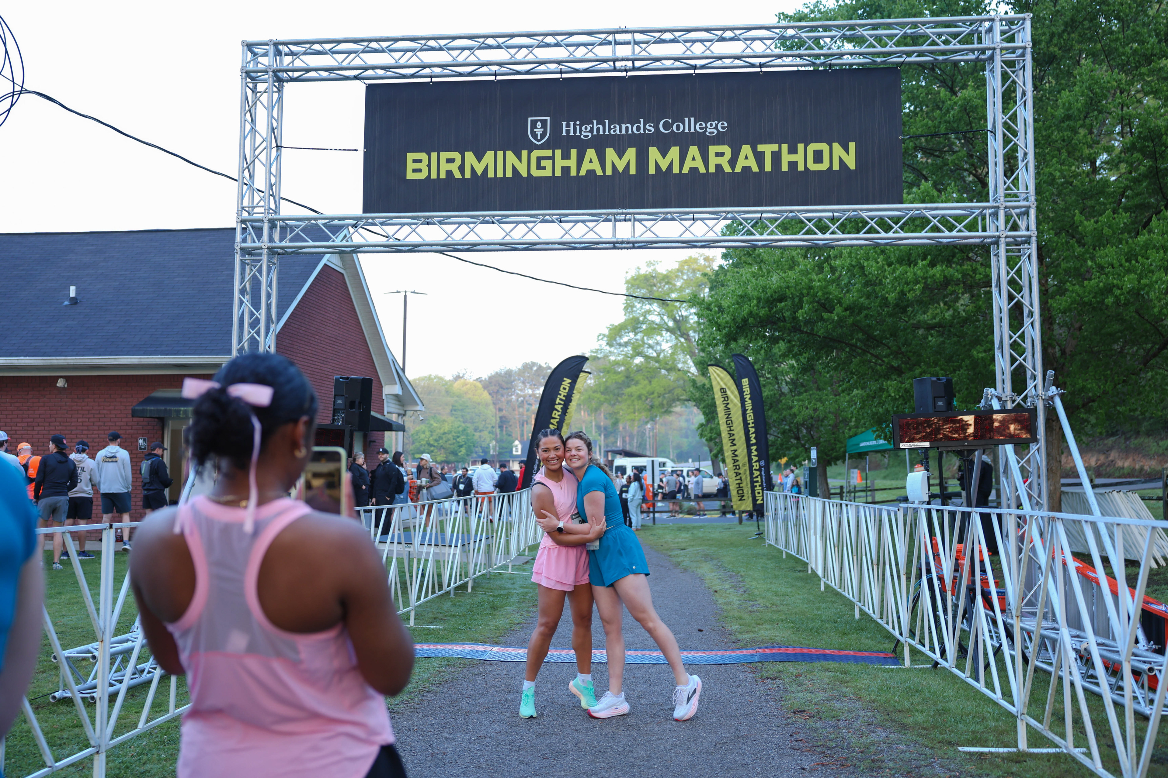
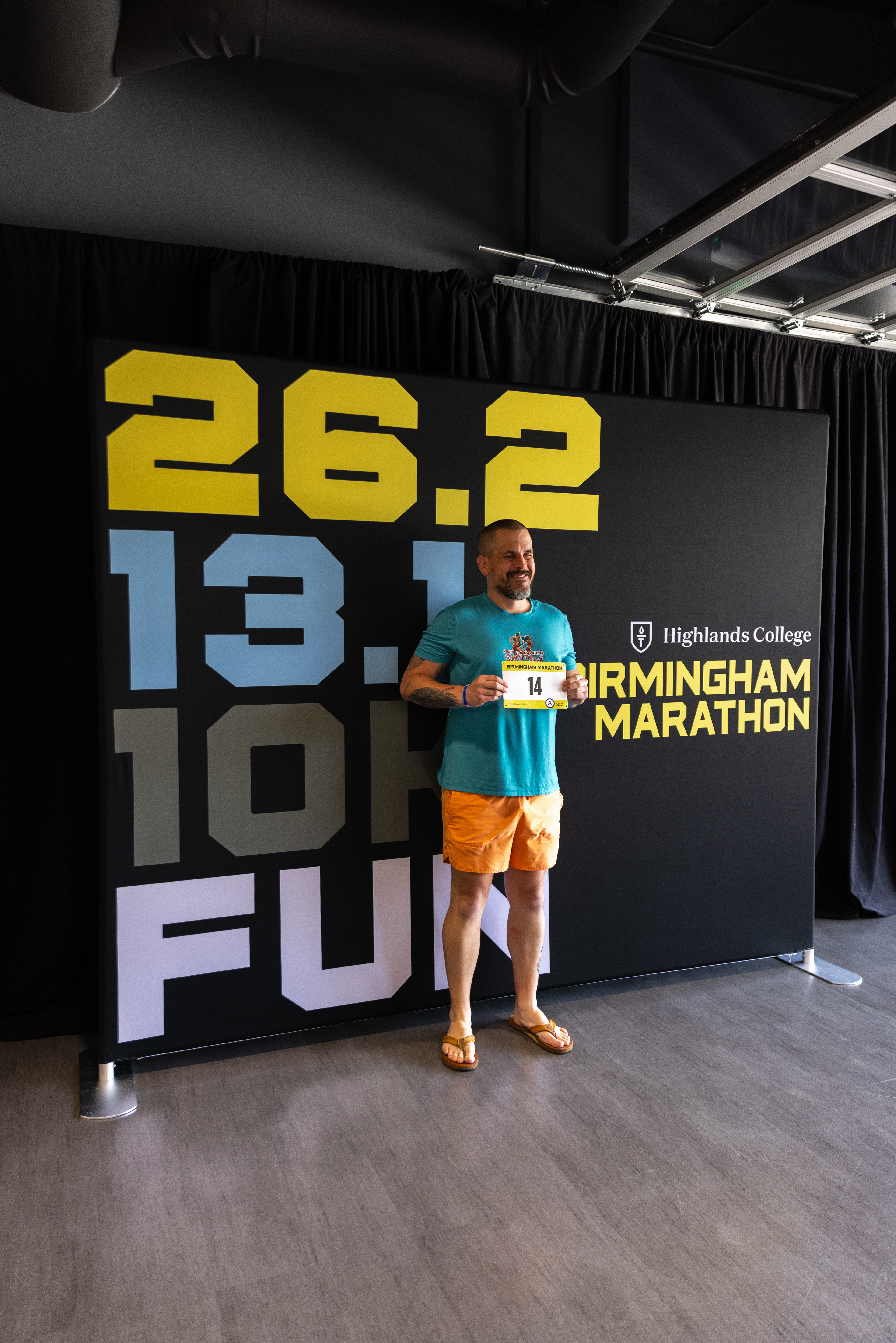
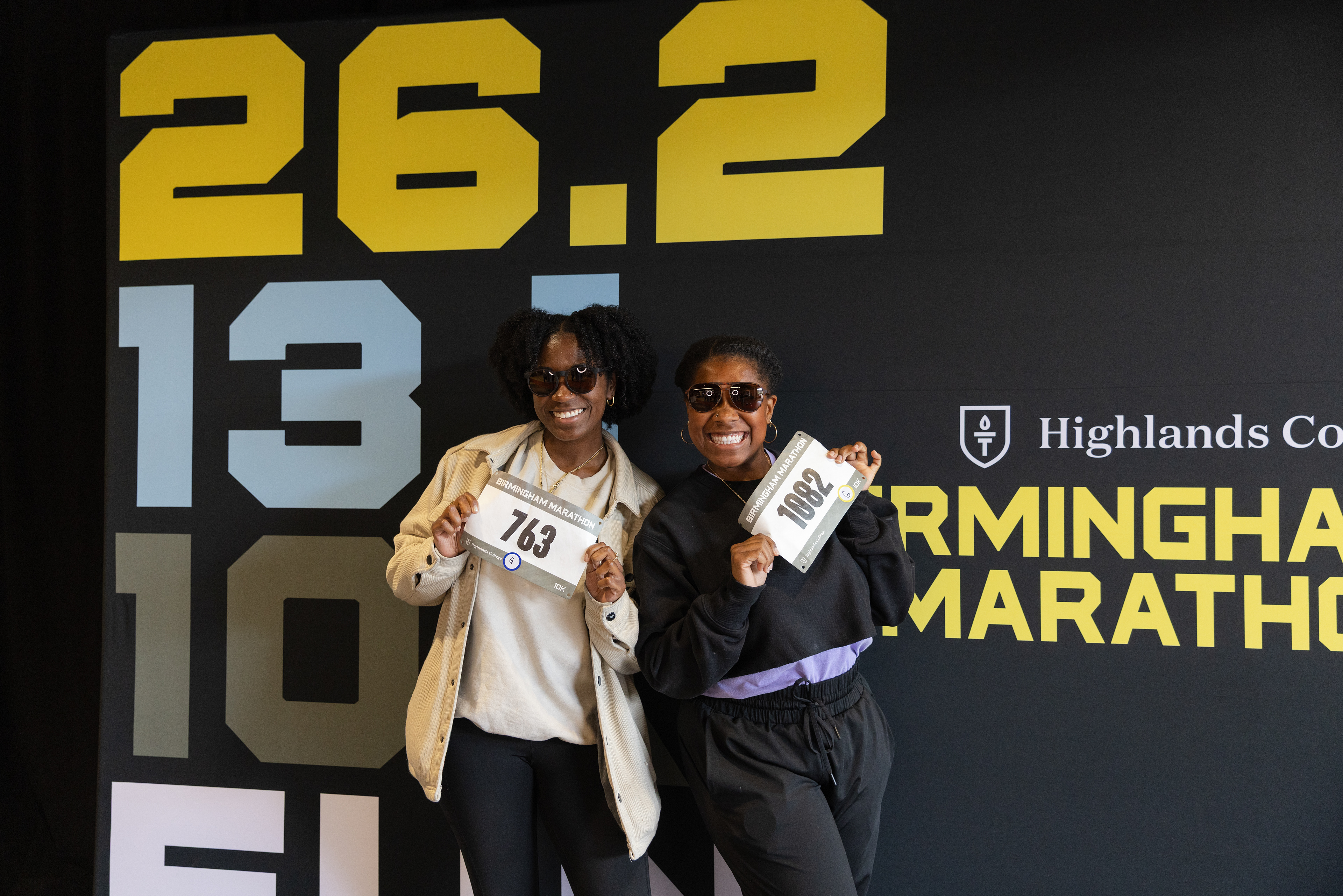
Photo Backdrop for Raceday
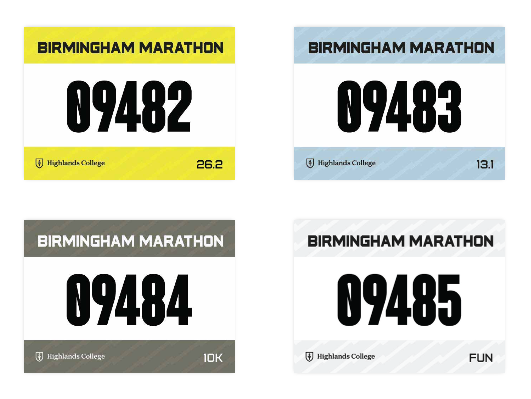
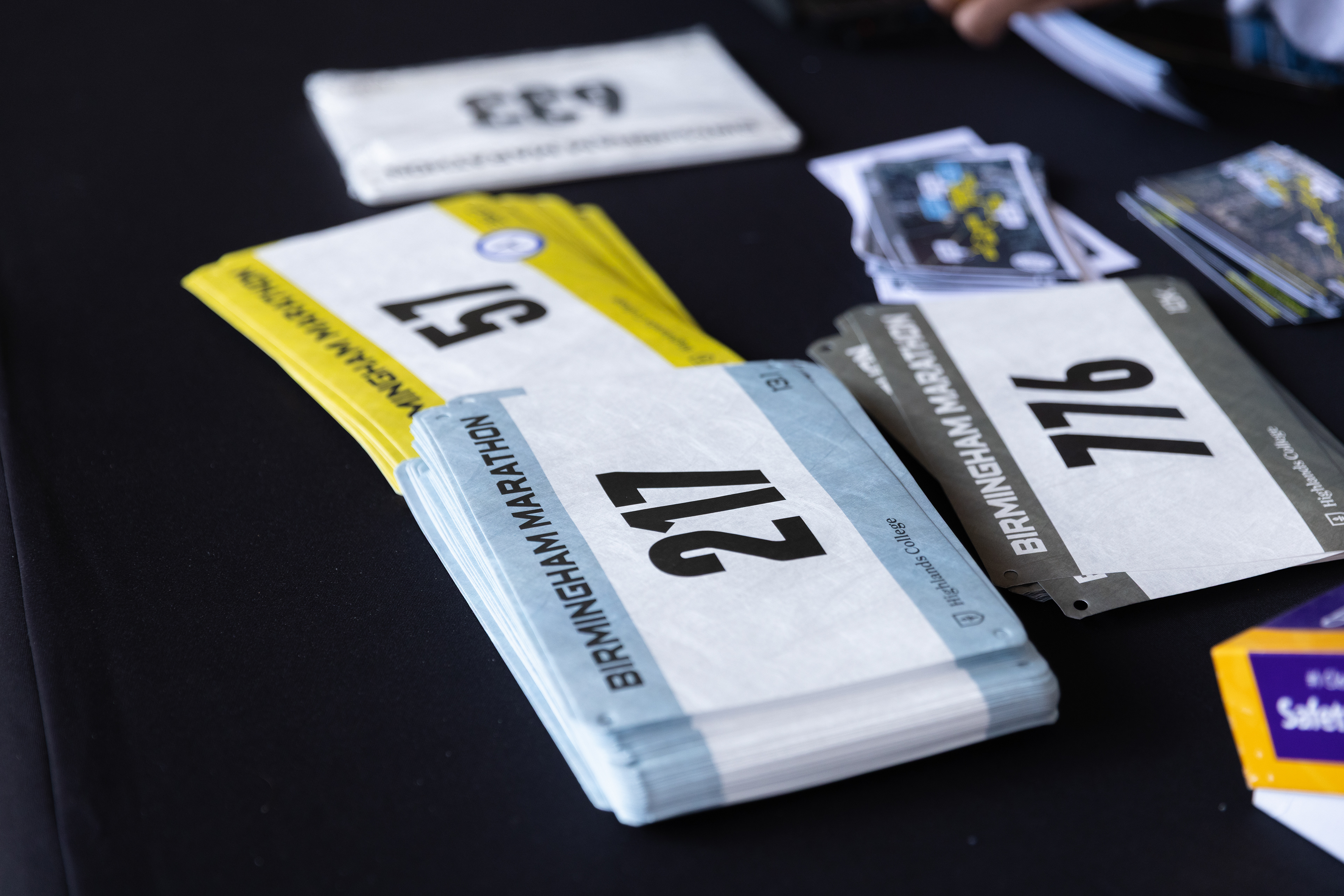
Racing Bibs
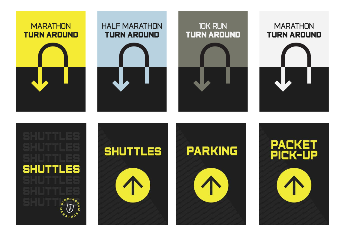
A-Frame Directional Signage
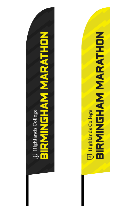
Flags
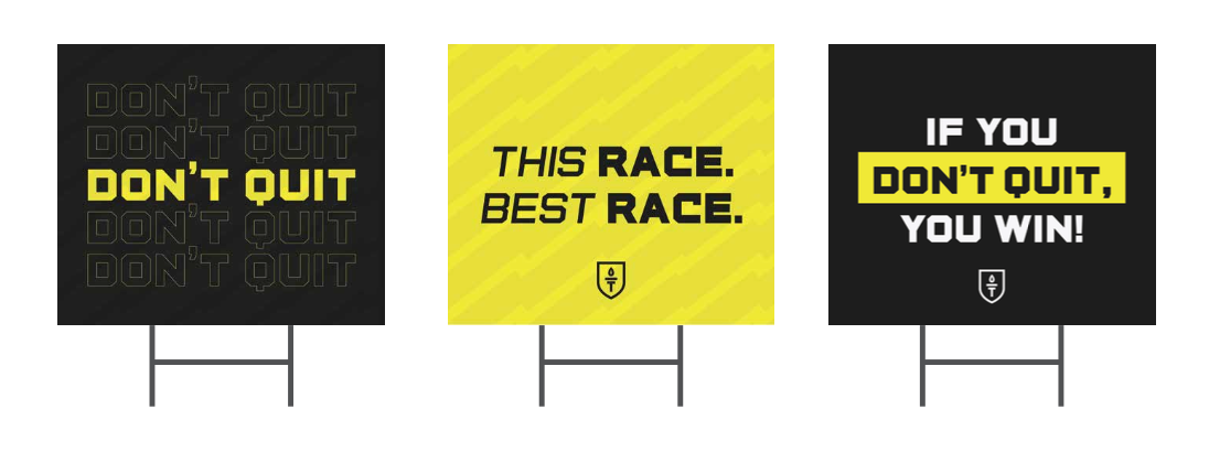
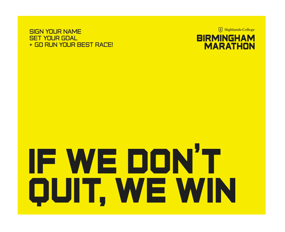
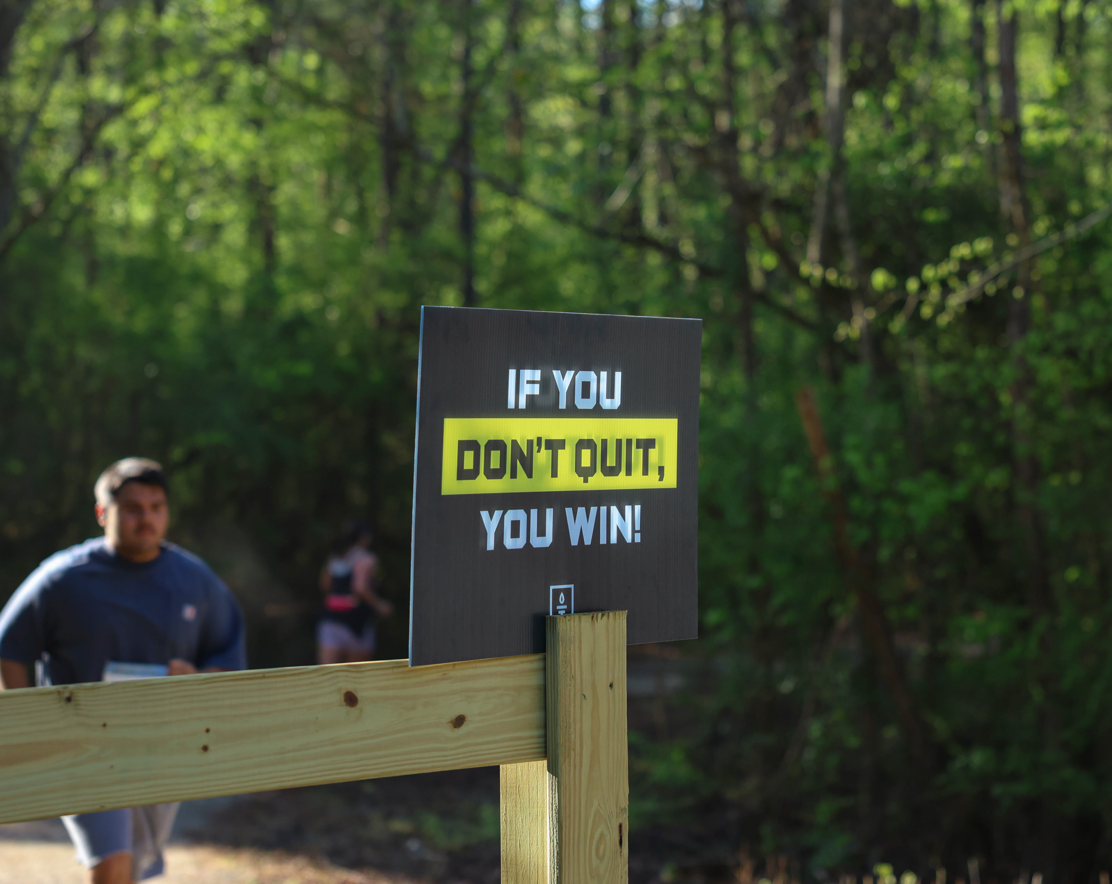
Yard Signage with Culture Quotes
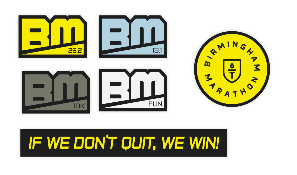
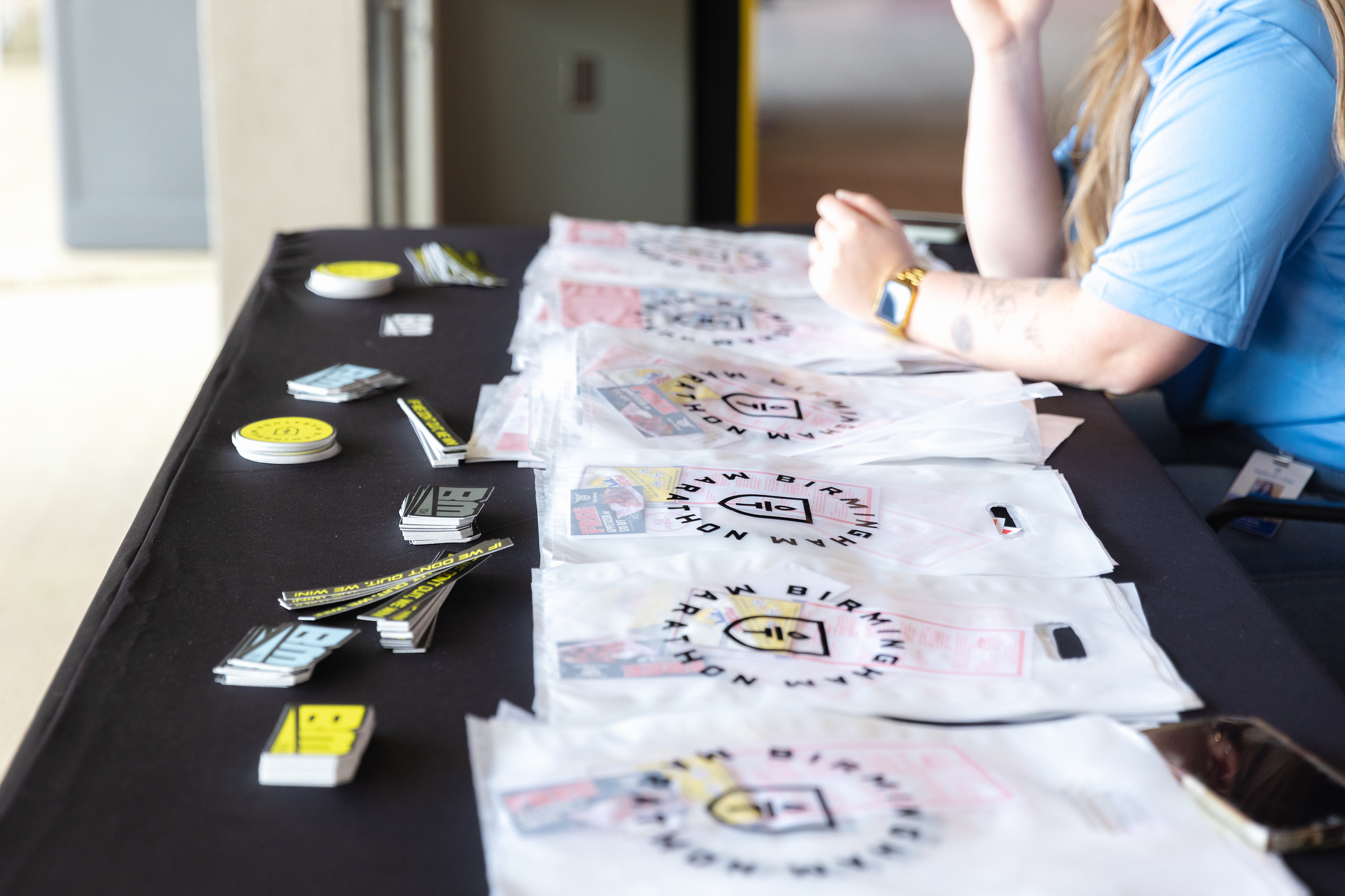
Stickers
Stickers for Fun Run Bib
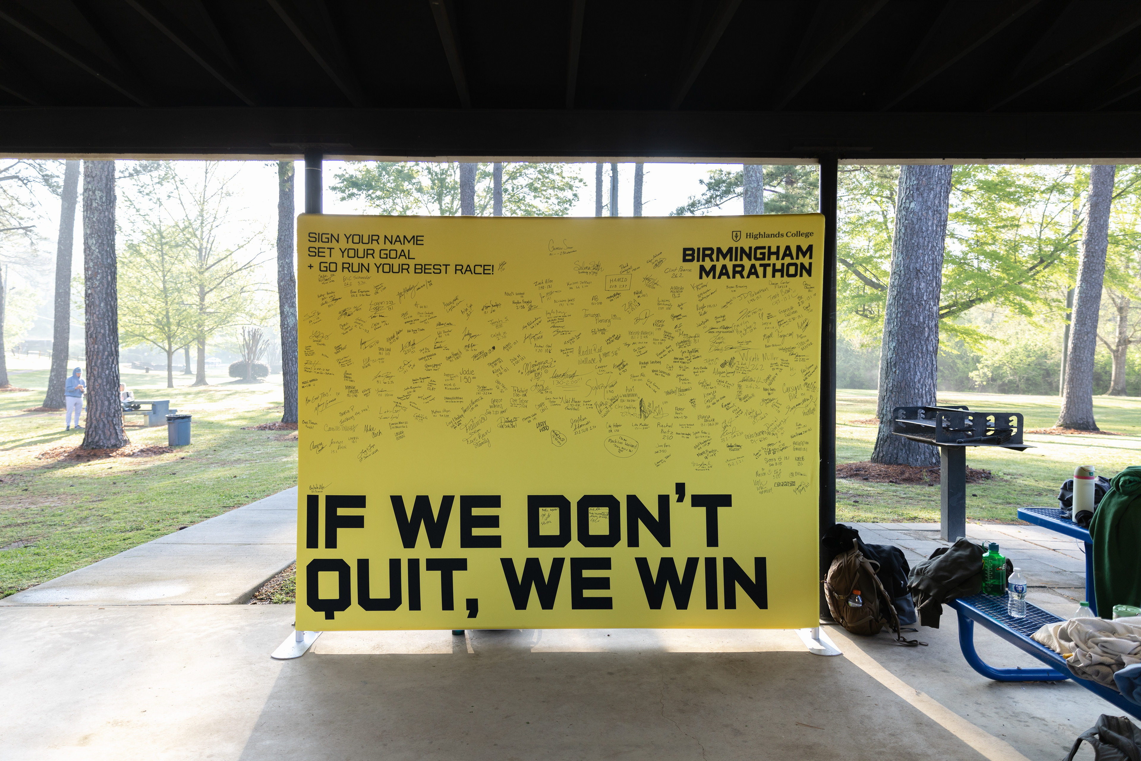
Signage Board
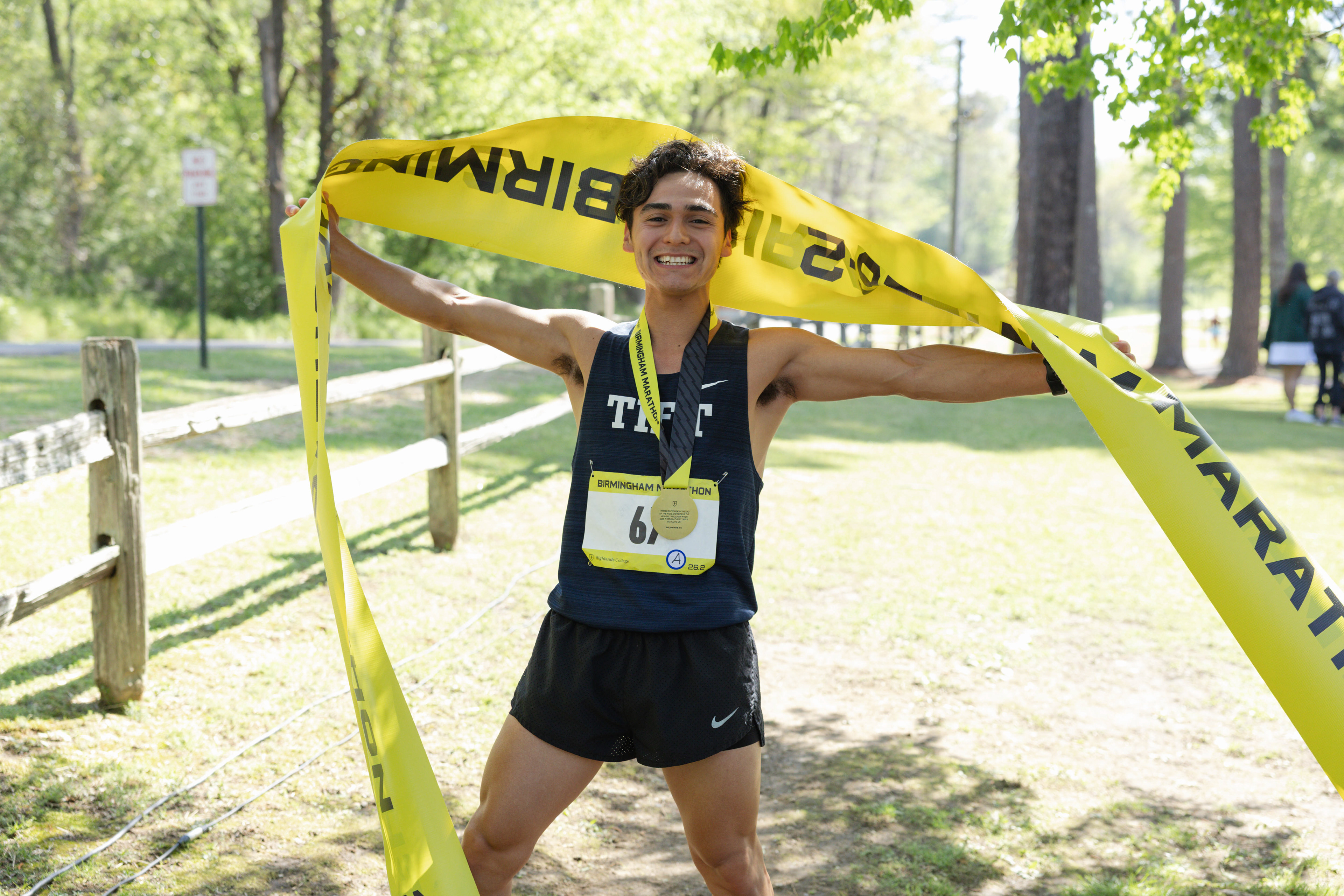
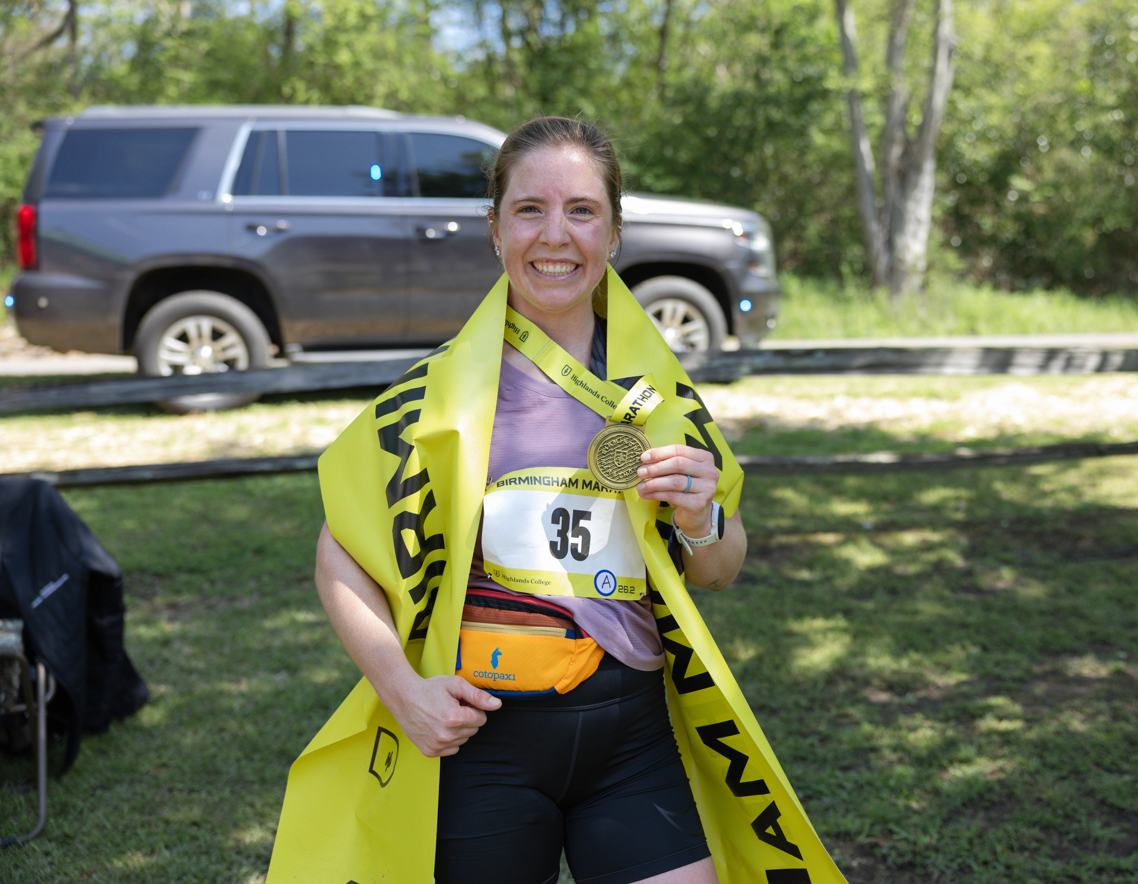
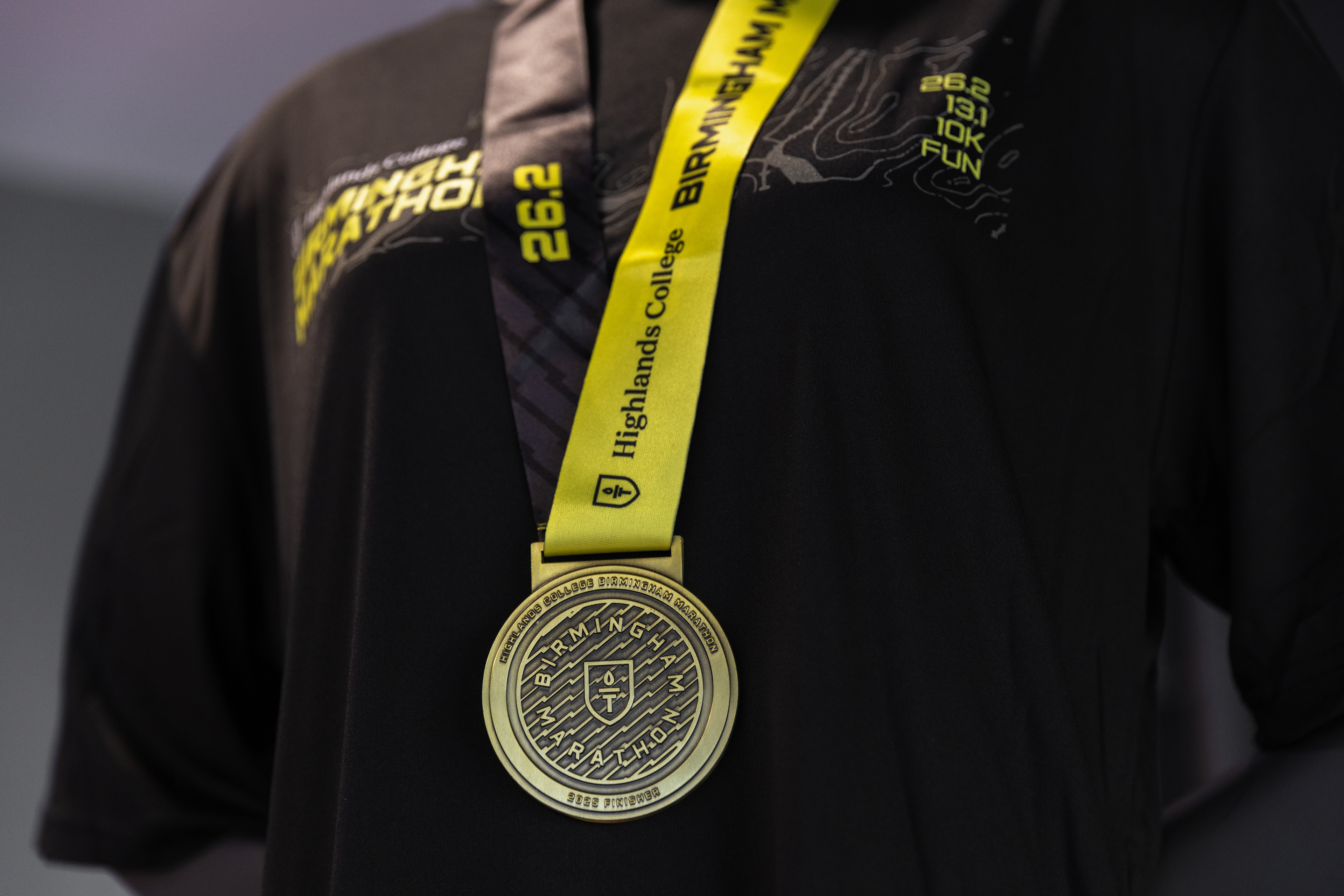
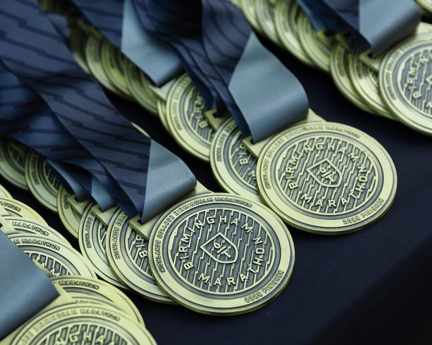
The final piece of design for this event was the design of the marathon medal. In 2025, we played it safe with the design and did one design finished in gold for all three races.
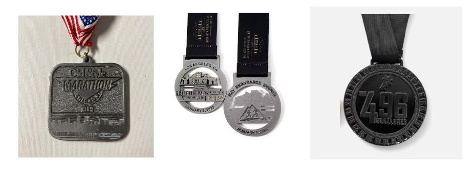
For the 2026 medal and in order to continue the idea of the unique history of Birmingham, I proposed that we used each mineral resource as a color reference for reach race medal. Each race medal would have a similar tint and would also correlate to the "hardness" of the mineral. This looked like:
Marathon = Iron Ore [the hardest of the three]
Half Marathon = Limestone
10K = Coal [the softest of the three]
This would be executed through having a different finish for each medal, as seen on the right.
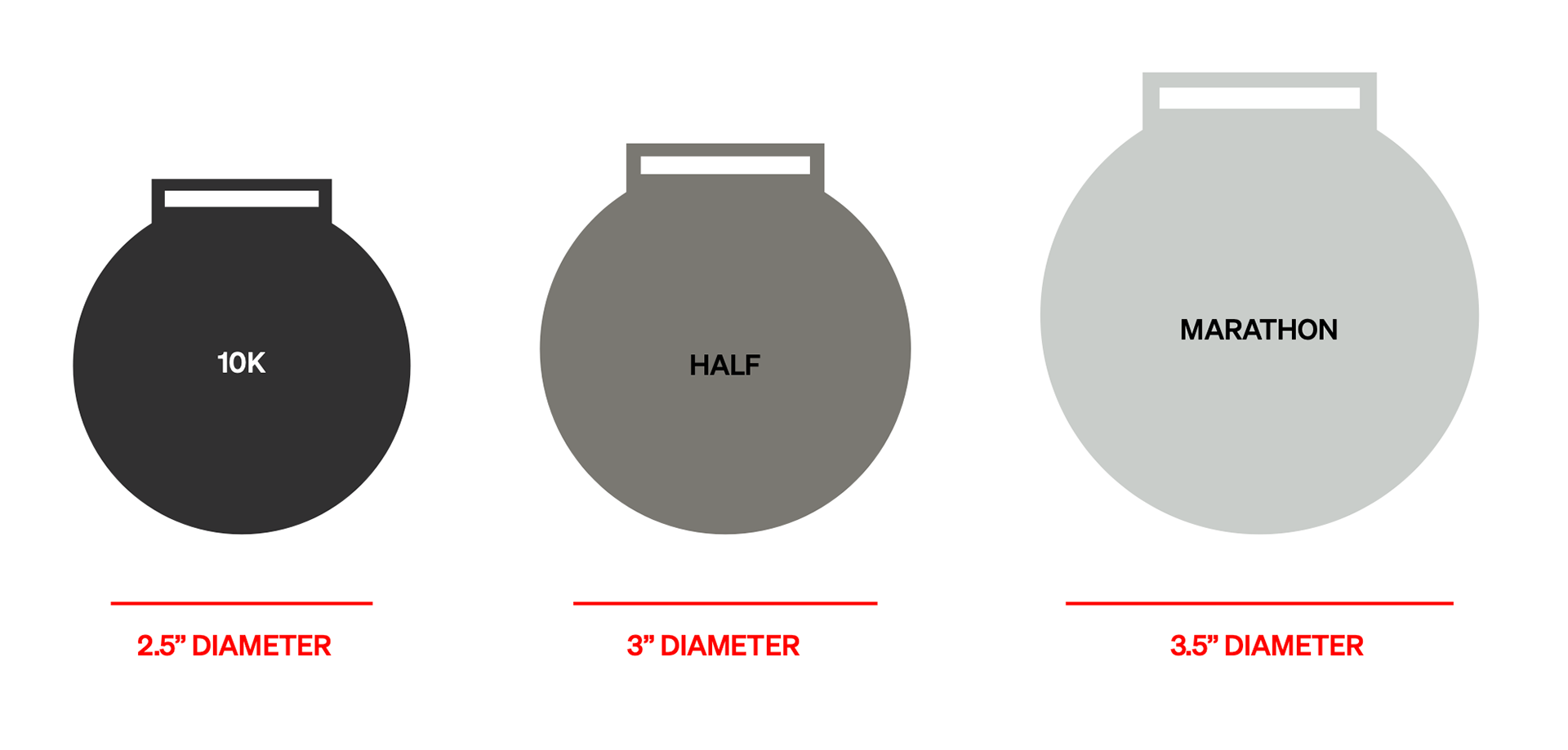
Suggested size variations between race.
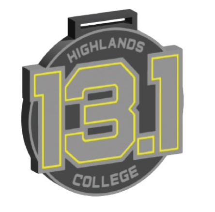
3D rendering of medal design
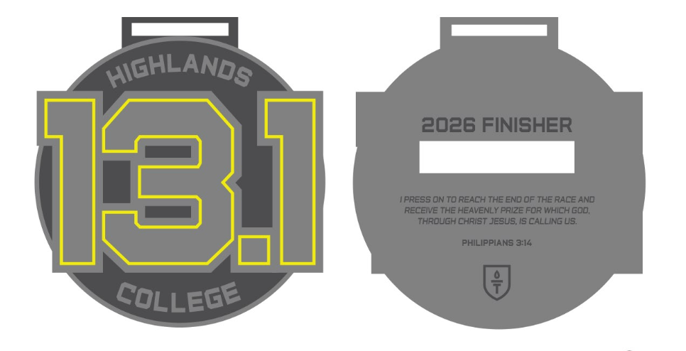
2D layout of medal deign
The 2026 medal is still going through production, but I'm looking forward to how this updated design will only continue to reflect the heart of the brand!